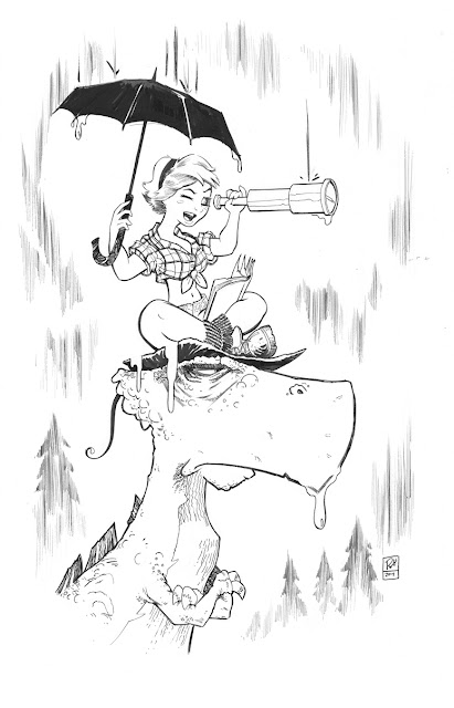
• Dames and Dinosaurs: All Wet •
I like drawing women and dinosaurs so why not put them together? This is the first print in a series themed: Dames and Dinosaurs. This was inspired from being shut in due to a rainy weekend in the SF Bay Area. I felt more like the dinosaur. I was not amused, lol. But, I was able to create this print so enjoy!
PROCESS
Sketch
First step is coming up with an idea and then thumb-nailing it. Unfortunately I've saved over my thumbnail so I can't share it. So I'm skipping ahead to the sketch. During the early stages of the drawing process I prefer to work digitally using Adobe Photoshop. This frees me up mentally because I'm not bound to the drawing since it's just pixels allowing me to make drastic changes to better the art. Once I get something I like I convert it to a blue lined image. For Photoshop Users: Image > Mode > GrayScale > Duotone. In the color adjustment window that pops up after selecting Duotone adjust just the Cyan channel only to your liking in the CMYK section and zero out the rest of the color channels. I have a printer that can handle 11x17 bristol so I print blue line directly on to the paper.
Pencils
Now that the sketch is blown up I'll go in and refine it further with blue pencil. Usually hands and faces need further refining. I stick to blue because it's easier to get rid of once it is scanned in allowing only the black ink to be left.
Inks
Now my FAVORITE part, inking. I've switched inking tools through the years. Currently I like Raphael 8404 Kolinsky Sable #1 as my brush and for the nibs I use a G-nib or a Maru nib. I use the brush when I need to create very controlled smooth lines with varying thickness. For example the girl is mostly brush. The nibs I use to get more of a sketchy drawing feel. The dinosaur is all nib so he is "rougher" in contrast to the girl. For my ink I enjoy cheap Speedball Special Black. It's watery which reacts better with a brush and if you're into washes you can get varying gray tones in the ink. The paper is Strathmore 500 series Semi-Smooth Bristol, which is kind of hard to find in art stores unless you have a nice comic community in your area. I order mine online from Blick Art. I use papers with a tactile surface as opposed to a smooth finish because I actually get more control when inking. As a professor explained to me if you zoom into the paper you will see that a rough surface will have peaks and valleys that are trying to grab at the bristles of a brush. This actually forces the brush to retain its tip allowing more control. Pretty neat, huh?
Once the inking is complete I scan in the image and get rid of the blue line using the Photoshop Channel Mixer. Then switch the image mode to grayscale and bump up the contrast so the black ink can really get beefed up. From there I color it.
I will admit this is brief outline and hopefully in the future I'll create a detailed document.
Until then if you have any specific questions about my process please shoot me an email: robinholsteindraws@gmail.com


